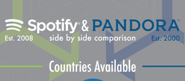
The moment you have all been waiting for… well, at least I would like to think you have been waiting for it. My completed infographic comparing Spotify and Pandora.
Read More
Sketches So I finally made some sketches for my infographic images. I really like some of the sketches a lot, but I will have to put a lot of work into them to have them look nice. I need three images at least on my infographic, this means that I will need to pick what data I want to represent in the overall design. Let me know which sketches you think have the most potential. Background I also started working on a background...
Read More
This weeks progress Soon will be that day that we know the answer to the age old question of whether Spotify is better than Pandora or not? At least that is kind of the reason for the survey that I sent out. I have 41 complete responses. Does this make me super confident in my data? I cannot be 95% sure that this response will give me accurate data, but the bigger issue is the bias of my sample; BYUI students are all pretty much the...
Read More
What’s this lovin’ about? Oh the beloved infographic. This week was all about getting information on the infographic that I are creating on Spotify and Pandora. I created a tentative list of questions to ask in a survey that I want to send to students at BYUI. I need to get the approval though the professor that allows students to perform research on campus. I sent an email to him last semester that I meant no harm in, but...
Read More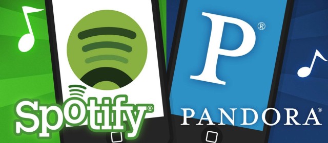
My question I don’t really understand why anyone uses Pandora anymore. I figure they either haven’t heard of Spotify, or their brain is being used in tests by aliens. Either way, I am going to do a cross comparison of Pandora and Spotify. Throw them in the ring together and see who wins. I have my guess, but maybe I am the subject of alien science… guess we’ll find out. Infographic I am doing this as my...
Read More